An OLED phone isn’t just a convenient proofing device; it’s a calibrated extension of your studio, ensuring your creative vision remains intact from screen to print.
- Infinite contrast allows you to spot subtle shadow and gradient errors that LCDs hide, preventing costly printing mistakes.
- High peak brightness and HDR support provide environmental adaptation, letting you work reliably in any lighting condition.
Recommendation: Prioritize an OLED display on your next mobile device not for entertainment, but as a direct investment in your workflow integrity and final output quality.
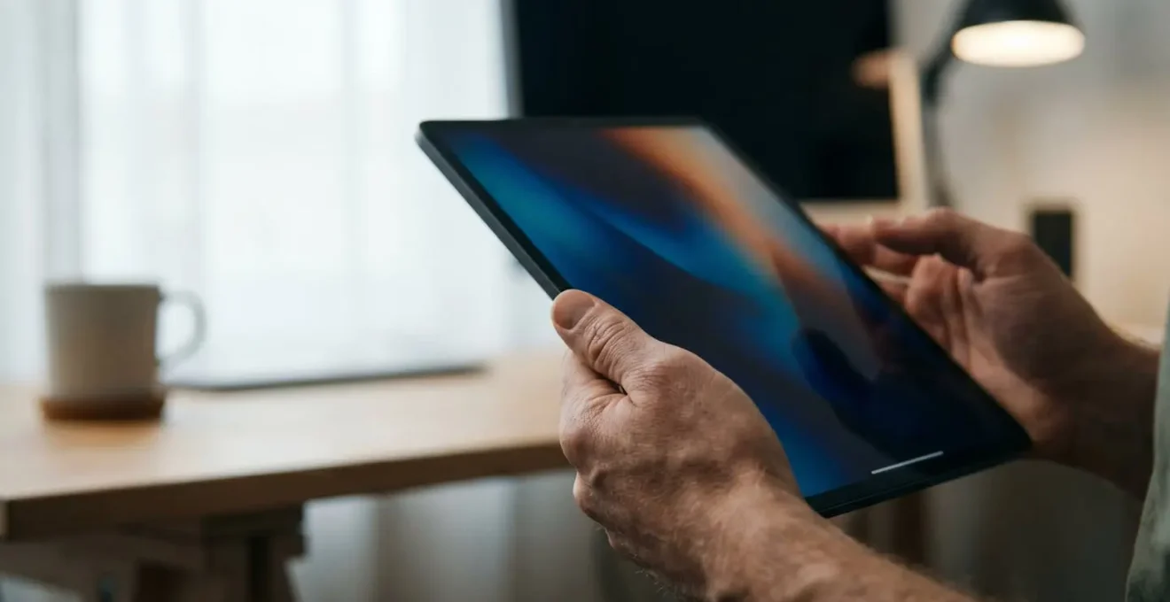
As a creative director, the most nerve-wracking moment isn’t the client presentation; it’s signing off on a final proof. We’ve all been there: reviewing a design on a phone, convinced it’s perfect, only to see the printed version and find muddy shadows or a color shift you never saw on screen. The convenience of mobile proofing often comes with a hidden tax—a loss of confidence in what you’re actually seeing. The standard advice revolves around color profiles and brightness settings, but these are merely adjustments on a flawed foundation.
Many discussions pit OLED against LCD in terms of generic consumer benefits like vibrant colors for movies or battery life. While true, this misses the point for creative professionals. The conversation should not be about which screen is « nicer, » but which technology provides genuine workflow integrity. It’s about whether your mobile screen is a source of approximation or a source of truth. We need to move beyond spec sheets and understand how the physics of a display panel directly impacts our ability to make critical creative decisions on the go.
But what if the key to mobile creative confidence wasn’t in software calibration, but in the fundamental way the screen itself produces light? This is where OLED technology becomes more than a feature; it becomes a precision tool. By controlling light at the pixel level, an OLED display doesn’t just show you a better picture—it reveals a more accurate reality of your work. This capability transforms a phone from a casual review device into a reliable instrument for professional assessment.
This guide will deconstruct the core OLED technologies that directly serve the graphic designer’s mobile workflow. We will explore how infinite contrast impacts print accuracy, how screen technology affects your visual stamina during long sessions, and why features like 10-bit color are essential for maintaining the perceptual fidelity of your work, even when you’re miles away from your calibrated desk monitor.
To navigate these critical aspects, this article delves into the specific technical advantages that make OLED a superior choice for creative professionals. Explore the sections below to understand how each feature translates into tangible benefits for your daily design and review process.
Summary: OLED as a Precision Tool for Mobile Creatives
- Why infinite contrast helps you spot editing errors before printing?
- How to hide static interface elements to protect your screen longevity?
- IPS LCD or OLED: which panel type is better for outdoor visibility?
- The screen dimming method that causes headaches for sensitive eyes
- How to use system-wide dark mode to save 15% battery on OLED screens?
- Why HDR makes dark movie scenes visible even under bright train lights?
- Why 10-bit color recording prevents « banding » in your sunset videos?
- High Refresh Rates: Why 90Hz Scrolling Reduces Eye Fatigue for Social Media Managers?
Why infinite contrast helps you spot editing errors before printing?
The term « infinite contrast » sounds like marketing jargon, but for a designer, it represents the single most important factor for print proofing: absolute confidence in your black levels. On a traditional IPS LCD screen, a backlight is constantly shining through a layer of liquid crystals. To display black, these crystals try to block the light, but some always bleeds through, resulting in a dark grey, not a true black. This backlight bleed fundamentally compromises your ability to judge subtle details in the darkest parts of an image. You might miss a low-opacity watermark, a faint gradient, or a color cast in the shadows simply because the screen can’t physically show it to you.
OLED technology eliminates this problem entirely through its use of self-emissive pixels. To display black, an OLED pixel simply turns off. It emits no light. This is « true black, » and it provides a perfect, untainted canvas against which all other colors are measured. When you’re preparing a design for CMYK printing, where black ink is a critical component, this level of accuracy is non-negotiable. You can see precisely how a dark blue will separate from a true black or spot banding in a near-black gradient that would be completely invisible on an LCD.
This pixel-level control ensures unparalleled workflow integrity. You can confidently make micro-adjustments to shadow details, knowing that what you see on your mobile screen is a faithful representation of the data in your file, not an approximation dictated by the limitations of a backlight. This prevents costly reprints and embarrassing client feedback, turning your phone into a reliable proofing tool.
As this macro view demonstrates, the ability for pixels to be completely off next to active ones allows for the kind of edge definition and low-light detail that is crucial for professional work. This isn’t just about making images « pop »; it’s about providing the perceptual fidelity needed to make informed, critical decisions before a design ever touches paper.
How to hide static interface elements to protect your screen longevity?
The one historical concern with OLED technology that gives creative professionals pause is the risk of « burn-in » or permanent image retention. This occurs when a static image, like a software toolbar or a status bar icon, is displayed for hundreds of hours at high brightness, causing those specific pixels to age unevenly compared to the rest of the screen. For a designer who might spend hours in an application like Adobe Fresco or Procreate, this is a legitimate concern. The user interface elements—tool palettes, layers, color pickers—are often static and could, over time, leave a faint ghost on the display.
However, modern OLED panels and operating systems have multiple mitigation strategies built-in. More importantly, you can adopt professional workflow habits to virtually eliminate the risk. The goal is not to avoid using your device, but to ensure dynamic pixel usage. Rather than being a deal-breaker, managing burn-in risk is simply a matter of smart practice, much like regularly calibrating a desktop monitor or cleaning a camera sensor. It’s a professional discipline that maintains the integrity of your tools.
Protecting your investment in a high-quality OLED display requires a proactive approach, especially during long creative sessions. The following checklist outlines concrete steps you can take to minimize the risk of burn-in and ensure the longevity and color accuracy of your screen. These practices focus on reducing the duration and intensity of static elements on your display, which is the primary cause of uneven pixel wear.
Action Plan: Preventing OLED Burn-In During Creative Work
- Enable full-screen canvas mode in creative apps to hide static toolbars and UI elements during long drawing or editing sessions.
- Take 5-minute « pixel refresh » breaks every hour: play a dynamic, colorful video or game to exercise all pixels and prevent image retention.
- Utilize OS-level pixel shifting features if available, but understand they offer minor aid for static creative software interfaces, not complete protection.
- Rotate your device’s orientation periodically if your app supports it, which helps distribute pixel wear across different screen areas.
- Avoid leaving static UI elements like navigation bars or tool palettes visible at maximum brightness for extended periods.
IPS LCD or OLED: which panel type is better for outdoor visibility?
A freelance designer’s office is often a coffee shop, a train, or a park bench. In these uncontrolled lighting environments, screen visibility is paramount. The battle for outdoor clarity is fought on two fronts: overcoming reflections and producing enough brightness to overpower ambient light. This is where the architectural differences between IPS LCD and OLED create a clear winner. An IPS display’s brightness is limited by the power of its single backlight. While modern LCDs can get bright, they struggle to compete with direct sunlight and often wash out, losing contrast and color saturation.
OLED technology provides superior environmental adaptation. Because each pixel is its own light source, the display can push specific parts of the screen to extreme levels of brightness without affecting the rest of the image. This is known as peak brightness. While the entire screen might sustain 800-1000 nits (a measure of light intensity), small highlight areas in an image or video can be boosted much higher. For example, some top-tier smartphones now boast a peak brightness of over 2,600 nits for HDR content. This incredible luminance helps cut through glare and makes the screen legible even in bright outdoor conditions.
Furthermore, the infinite contrast ratio of OLED plays a crucial role here. On an LCD, as you crank up the brightness to combat sunlight, the black levels also rise, making the entire image look hazy and washed out. With OLED, even at maximum brightness, the black pixels remain perfectly black because they are simply turned off. This maintains the image’s dynamic range and color saturation, ensuring that your design’s perceptual fidelity is preserved. You can discern subtle color variations and read text clearly, allowing you to work confidently, no matter your location.
This combination of high peak brightness and perfect black levels means that OLED displays are not just better for outdoor use—they are fundamentally more reliable as a professional tool in unpredictable environments. They allow you to maintain your creative flow without being forced to find a shady spot just to review a proof.
The screen dimming method that causes headaches for sensitive eyes
As a creative, you spend hours staring at a screen, often late at night when you’ve finally found your flow. Adjusting screen brightness for comfort is second nature, but you may have noticed a peculiar side effect on some phones: eye strain, fatigue, or even headaches when the screen is dim. This isn’t just your imagination; it’s a physiological reaction to a screen dimming technology called Pulse-Width Modulation (PWM), which is common on many OLED displays. Instead of lowering the voltage to dim the pixels (which can affect color accuracy), PWM works by flickering the screen on and off at a very high speed. The lower the brightness, the longer the « off » phase, which your brain perceives as a dimmer image.
While this flicker is too fast for most people to consciously see, the subconscious brain and optic nerve can still detect it. For a significant portion of the population, this can be problematic. In fact, research on pulse-width modulation indicates that up to 30% of users experience increased eye strain and fatigue due to this imperceptible strobing effect. This can severely impact your visual stamina, cutting short productive work sessions and causing discomfort. The alternative is DC dimming, which adjusts brightness by varying the electrical current, providing a flicker-free experience but sometimes at the cost of color fidelity at very low brightness levels.
For a designer, whose eyes are their most critical tool, understanding your sensitivity to PWM is crucial. If you find yourself ending work sessions with tired, dry eyes or a lingering headache, your screen’s dimming method could be the culprit. Fortunately, you can test for this and find devices or workarounds that prioritize visual comfort.
Checklist: Identifying and Mitigating PWM Flicker Sensitivity
- Self-Test: Use your phone’s slow-motion camera (240fps or higher) to record your OLED screen at low brightness. Visible horizontal bands scrolling across the screen are a clear sign of PWM flicker.
- Symptom Check: Work on your device for 30 minutes at around 30% brightness. If you experience unusual headaches, eye strain, or visual fatigue, you may be sensitive to PWM.
- Solution 1 (Device Choice): Prioritize devices that advertise high-frequency PWM (e.g., 960Hz or higher) or offer a « DC dimming » or « Anti-flicker » mode in their settings.
- Solution 2 (Software Toggle): On some Android devices, enable DC dimming in Developer Options. Be aware this can slightly crush shadow detail at the lowest brightness levels.
- Solution 3 (Workaround): On devices without DC dimming (like iPhones), keep brightness above 50% where PWM is less aggressive, and use the « Reduce White Point » feature in Accessibility settings to lower the perceived brightness without triggering low-frequency PWM.
How to use system-wide dark mode to save 15% battery on OLED screens?
For a freelance designer on the move, battery life is currency. Running out of power in the middle of a client call or while finalizing a proof is not an option. While carrying a power bank is a common solution, optimizing your device’s native power consumption is a smarter strategy. This is another area where the fundamental architecture of OLED provides a tangible benefit, directly tied to a feature you already use: dark mode. On an LCD screen, dark mode is purely aesthetic. Since the backlight is always on, displaying a black pixel requires the same amount of energy as displaying a white one.
With an OLED display, the relationship between color and power is direct. Since each pixel is an individual light source, a white pixel is at full power, a grey pixel is at partial power, and a black pixel is completely off, consuming zero power. When you enable a system-wide dark mode, every part of the user interface that turns from white to true black (#000000) is effectively turning off a portion of your screen. This isn’t a minor tweak; the energy savings are substantial. This direct link between color and power consumption is unique to self-emissive technologies like OLED.
The impact is significant, especially at higher brightness levels. Comprehensive research on OLED dark mode battery impact found that savings can range from 5.6% to 44.7% at 100% brightness, depending on the application. For a designer working in a bright café with their screen brightness turned up, switching to dark mode can mean the difference between lasting through the afternoon or hunting for a power outlet. Furthermore, many apps use a dark grey instead of true black for their dark themes. While still helpful, only true black delivers maximum power savings.
This visual metaphor illustrates the core principle: dark grey still requires pixels to be partially lit, consuming energy, whereas true black allows them to switch off entirely. As a professional, choosing apps and OS themes that use true black is a strategic decision that directly extends your ability to work untethered, preserving that crucial resource of battery life.
Why HDR makes dark movie scenes visible even under bright train lights?
While you might associate High Dynamic Range (HDR) with watching blockbuster movies, its underlying technology is profoundly useful for a creative professional’s workflow. HDR is not just about making colors more vibrant; it’s about expanding the range of light and shadow a screen can display simultaneously. Standard Dynamic Range (SDR) content has a limited brightness range. If you expose for the bright parts of an image, the dark parts become crushed into a uniform black. If you lift the shadows, the bright parts blow out to a uniform white. You lose detail at both ends of the spectrum.
HDR content, displayed on a capable OLED screen, shatters this limitation. It allows for the display of intensely bright specular highlights (like the glint of sunlight off metal) right next to deep, detailed shadows. This is possible because of OLED’s pixel-level control. Each pixel can output its own precise level of brightness, independent of its neighbours. For instance, Apple’s latest iPad Pro specifications state its OLED display can reach 1,600 nits peak brightness for HDR content, allowing it to render incredibly bright elements without washing out the rest of the scene.
This capability is a game-changer for photo and video editors. It allows you to assess the full dynamic range of your source file accurately, even in a challenging viewing environment like a brightly lit train. You can see the subtle texture in the darkest parts of a subject’s clothing while also judging the fine detail in the clouds of a bright sky, all within the same frame. This prevents guesswork and ensures your edits will translate well across different displays.
Case Study: The Wedding Photo Test
Professional photographers often face the challenge of editing a wedding photo with detail in both the bride’s white dress and the groom’s black tuxedo. On traditional displays, adjusting exposure to preserve the delicate texture in the white dress often crushes the shadow detail in the suit. Conversely, lifting shadows to reveal the suit’s fabric can blow out highlights in the dress. An HDR-capable OLED display solves this by allowing the simultaneous visualization of both extremes. Its infinite contrast means a designer can confidently adjust the brightest highlights on the white fabric and the deepest shadow textures on the black fabric in a single session, ensuring a perfect final image.
Why 10-bit color recording prevents « banding » in your sunset videos?
You’ve seen it before: a beautiful video of a sunset, but the sky, instead of showing a perfectly smooth gradient of color, is marred by distinct, distracting bands or steps of color. This phenomenon is called color banding, and it’s the result of not having enough color information to represent a subtle transition. This is the critical difference between an 8-bit and a 10-bit display. Most consumer screens are 8-bit, meaning they can display approximately 16.7 million colors. While that sounds like a lot, it’s often insufficient for rendering smooth gradients of a single hue.
A 10-bit display dramatically expands this palette. The « bit depth » refers to the amount of information used for each of the three primary color channels (red, green, and blue). According to display color depth specifications, a 10-bit panel offers 1,024 steps per channel, resulting in a total of 1.07 billion colors. That’s over 60 times more color information than an 8-bit panel. This vast increase in color data means the display has far more « in-between » shades to work with, allowing it to render those sunset gradients and other subtle tonal shifts with perfect, imperceptible smoothness.
For a designer or videographer, working on a 10-bit capable OLED screen is essential for workflow integrity. It ensures that you are seeing a true representation of your 10-bit source footage. If you edit 10-bit video on an 8-bit screen, you won’t be able to tell if banding is present in your actual file or if it’s just a limitation of your monitor. An OLED display with 10-bit support removes this ambiguity, giving you the confidence that your final exported video will be as smooth as you see it on your screen. As a leading authority in display technology points out, this has a direct impact on quality.
Models with higher bit-count LUTs and internal calculations tend to produce smoother tonal transitions and better representation of tones in shadow areas. Such products have almost no tone jumps or hue divergence.
Key Takeaways
- OLED’s true black is a non-negotiable tool for accurate print proofing, revealing shadow details that LCDs hide.
- High refresh rates and flicker-free dimming are not just comfort features; they enhance visual stamina for longer, more productive work sessions.
- 10-bit color and HDR support are essential for maintaining the perceptual fidelity of your work, ensuring smooth gradients and accurate dynamic range from capture to final edit.
High Refresh Rates: More Than Just Smooth Scrolling
High refresh rates on mobile displays are often marketed to gamers or for « buttery smooth » social media scrolling. While a 90Hz or 120Hz display certainly makes these tasks more pleasant, for a creative professional, the benefit is far more profound. It’s about achieving perceptual fidelity in motion and interaction. A standard 60Hz display refreshes its image 60 times per second. A 120Hz display does it 120 times per second. This doubling of information reduces motion blur and, most critically for designers, cuts down on input latency.
When you’re sketching, painting, or doing detailed retouching with a stylus, latency is the perceptible delay between your hand movement and the line appearing on the screen. On a 60Hz screen, this delay can be just enough to break the illusion of drawing on paper, forcing your brain to subconsciously compensate. This can lead to less accurate strokes and a feeling of disconnection from your work. A 120Hz display halves the time between frames from 16.7ms to just 8.3ms, making the digital ink appear to flow from the stylus tip almost instantaneously. This isn’t a luxury; it directly impacts the quality and precision of your work.
This reduction in latency is vital for maintaining a creative flow state. It removes a layer of technological friction, allowing for a more natural and intuitive creative process. Even for tasks that don’t involve a stylus, like dragging elements in a layout or scrubbing through a video timeline, the immediate feedback of a high refresh rate display makes the entire workflow feel more responsive and precise.
Case Study: The Pen-on-Paper Feel with 120Hz Displays
For digital artists, the leap from 60Hz to 120Hz is a fundamental shift. At 60Hz, quick stylus movements can outpace the display’s refresh rate, creating visible ghosting or smearing where fast lines appear less precise. This is problematic for inking and calligraphy. At 120Hz, the reduced frame time means the feedback loop between stylus input and on-screen rendering becomes nearly simultaneous. Artists report that pressure changes and direction shifts appear so quickly that the perceptual gap between hand movement and visual feedback disappears, recreating the natural pen-on-paper experience. This reduced latency directly improves drawing accuracy and comfort during long sessions.
Ultimately, choosing an OLED display for your mobile device is a strategic business decision. It’s an investment in accuracy, reliability, and professional confidence. By understanding these technical advantages, you can ensure that your work maintains its integrity, from the first sketch on a train to the final print run, no matter where your creativity takes you.